The new UX concept for the existing ERP system brings clarity to the processes and helps the team to work more efficiently. The concept also includes clear guidelines for future enhancements and adjustments.
We started with the navigation and interaction concept. In the second step, we focused on the detailed workflows in the ERP to optimize the main processes and also to better consider the edge cases.

rona:systems is a leading manufacturer of innovative software, dispatching, and telematics solutions for the waste management and recycling industry. Within the EU, rona:systems has approximately 650 customers.
Our services
- UX-concept
- Wireframing
Initial situation
Rona has been providing an ERP system for its customers for years. The system was evolving due to various customer requirements and was threatening to burst at the seams. Therefore, Rona came to us with the desire to rethink the UX concept.
We took care of a clear structure in the overloaded user interface and the optimization of the complex processes. Of course, also to make room for the enhancements that will continue to exist in the future.
Our goal was to enable future users to find their way around the ERP system after a short training period and to work efficiently without much prior knowledge.
5-level navigation
To counteract the complex structure of the ERP software and to present the multitude of options clearly, we have divided the navigation structure in the new UX concept into five levels.
The clear navigation structure can be found classically on the left side and shows the first two levels there. Mouse-over on the second level opens the third level, which links to an overview page for the menu items below. On this overview page, the most frequently used pages are placed at the top, and below them are further links that lead to detailed pages in a categorized manner.

Information hierarchy on detail pages
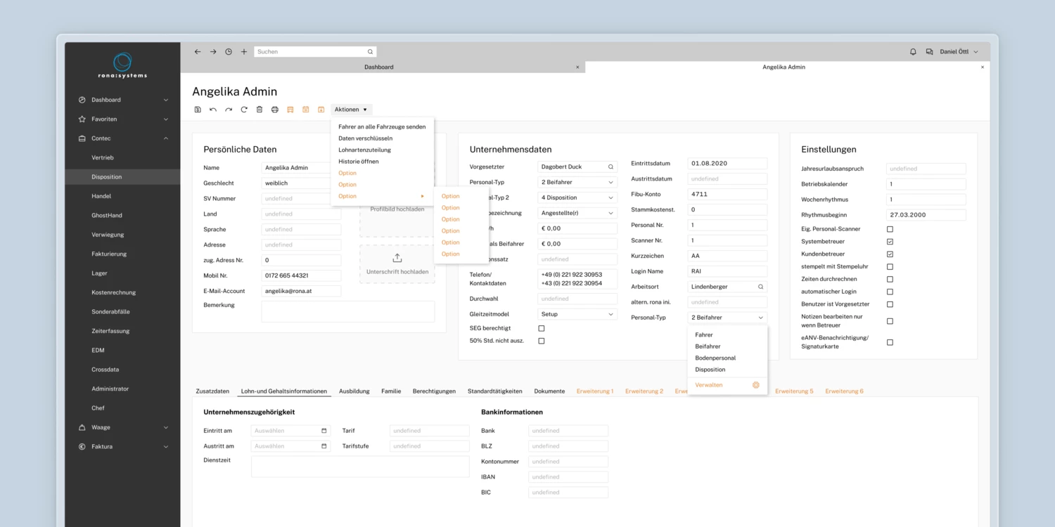
While the navigation deals with the big picture, the detail pages focus on the extensive data. To ensure that there is a consistent approach, we split them into individual cards.
Previously, detailed information was not grouped, but arranged directly next to each other. In the new concept, information is grouped by relatedness and can be sorted by importance.
In the upper two thirds of the screen, the most important data is displayed. Below that is a card with tabs for the less frequently used data. With this hierarchy, employees can find the most important data records quickly and in a structured manner.

Individual expansion options
Until now, feature enhancements always had to be weighed up, because every enhancement went to all customers. As a result, the interface was filled with features that many users never needed.
The redesign also introduced the possibility of individual extensions. This means that each company only receives the features that are relevant to them. Such extensions can either be special functions that appear as an option in the Actions dropdown, or frequently used functions that get their own icon next to the Actions dropdown.
There is also room for additional data categories: These are added as additional categories in the lower third. Customers determine the priority themselves and thus decide where they are displayed.

Dispatching via drag-and-drop
An overview of open orders and available vehicles is essential for dispatching. They need the flexibility to restructure, move and re-sort.
To make standard processes even easier, filter combinations can be saved per person. These combinations are displayed as tabs above the search bar for easy switching and further filtering.
The split list view on one screen allows the dispatcher to assign and rank orders to a vehicle using drag-and-drop. Only when everything is in place, the orders are finally dispatched.


Complete process on one screen
The majority of the order acceptance process takes place via a telephone call, during which the data is passed on and entered directly by the administrative staff.
To support the team in taking orders, we have structured the processes to match the telephone call and divided the processes into five cards. This way, the question "Who does what, where and with what?" is already answered during the call. Instead of jumping from window to window, all information is bundled on one screen and easy to find.
To prevent errors, the contents of the columns are interdependent. When an order is received, users can click through from left to right and take and schedule the order with all special conditions within seconds

»With the modernization of the framework, the interfaces and masks of the ERP system were also revised. The process, professionally managed by Fusonic, resulted in new design and operating approaches that generated enthusiasm.«


