We use this onboarding guide to show new developers how to use Figma in order to improve our Design—Dev handoff process. Through this Figma guide they get familiar with the design files and quickly find the right elements and measurements.
Let me show you how we onboard a new hire to Figma. We start off by explaining the basics of the UI and how to find the elements they are looking for.
- Author
- Daniel Öttl
- Date
- March 22, 2023
- Reading time
- 8 Minutes
Using Figma sidebars
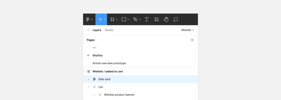
The software consists of a left sidebar, a canvas and a right sidebar. With viewer rights (which you usually have as a developer) you will only see the “inspect” tab on the right and measurement labels on the canvas when selecting elements.
The left sidebar lists pages and layers. Pages can also be hidden, so be sure to show them by clicking the page name with the small arrow on the top right of the left sidebar.
Use the list of layers to navigate to the frame (screen or element) that you want to inspect and also to make sure that you have selected the correct element.
Side note to all designers: Please name your layers in order for developers to understand what they are looking at.
Inspecting the right elements
While navigating through the design and inspecting elements, always keep an eye on the layers panel on the left sidebar. In there you will find these elements:
Regular elements
- Text layers
These are symbolized by an uppercase T. - Shapes
These are symbolized by their shape. - Frames
These are symbolized by a hashtag sign. Usually the top layer of a designed screen is a frame. But frames can also be nested to create more complex designs. - Groups
These are symbolized by a dotted square. - Frame with with Auto Layout
These are symbolized by three horizontal or vertical lines. The containers are also frames but with Auto Layout applied to them. Auto Layout behaves just like Flexbox in code. This means that elements inside an Auto Layout Frame keep their distances when they change in size.
Components
The main component is symbolized by a rhombus filled with four squares (called Diamond in Figma). Throughout the design you will mostly see outlined Diamonds which symbolize that they are instances of the main component.
In addition to the symbol they are also colored in purple instead of black. This makes it easier to see which elements are nested inside a component.

Measuring the correct element
Most of the time elements are nested deeply which would take you a lot of double clicks to enter each layer. A shortcut to get to the lowest level of the element you want to inspect is by holding Ctrl/Cmd while you click.
On text layers this trick will save you some time, but be aware that on vector elements (e.g. icons) this is not the layer you want to take the measurements of. Usually icons and other vector elements are placed inside of a container that controls the spacing to other elements. This can be also true for text elements, so make sure you double check which element you have selected in the layers panel.
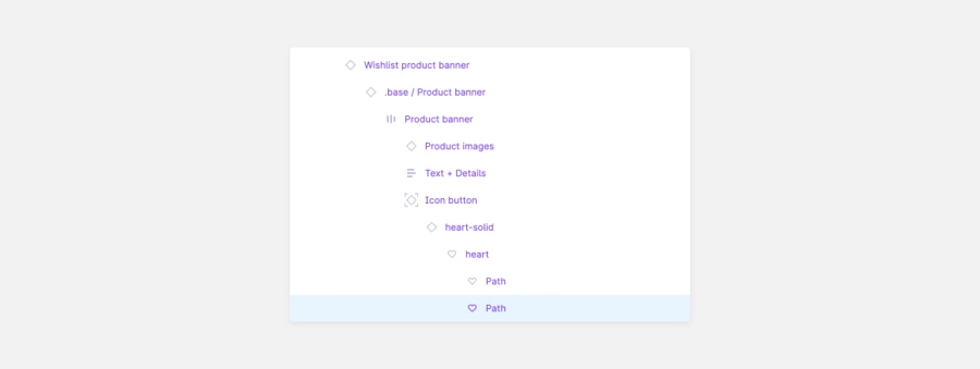
A very good indicator for wrong measurements are decimal values. This example shows the outer line of the icon. For comparison, the container of the icon is shown on the right, with the correct distances to the next larger container (button).

To see the component isolated from everything else, you can click on the tilted arrow in the open box icon which then takes you to the file where the main component is positioned. Usually this is a separate library file which hosts all (shared) components of the project.

Exporting files (JPG, SVG)
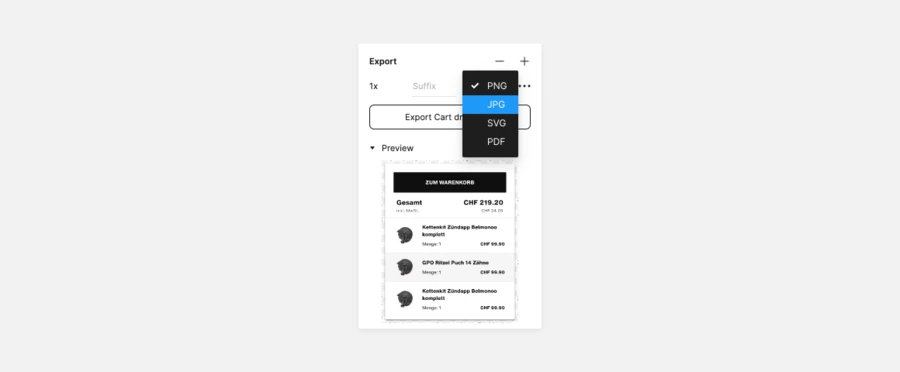
All elements can be prepared for an export via the + icon in the “Export” tab in the right panel. You can choose the size and file format for the export. To finally export the file you have to press the button below.
Below the export button you can click on Preview to see what your export will look like.
Finding the next screen when you are lost
In general it is the designers job to link the right screens and provide enough context in the issue/ticket. When you open the file via the provided link Figma pre-selects the linked screen and zooms you into the right position. If no element is specifically selected during the link-creation Figma zooms you out so that you see all elements on that page.
Be aware that Figma saves your position and zoom level per page so that when you switch between pages, your position stays the same. In case you get lost, an easy way to find the next artboard is the shortcut “n”. This shortcut zooms you in so that you see the artboard fully.
Extra tipps: Plugins in Figma
I have prepared two extra tipps which are helpful in the beginning of a project, but require edit rights on the file as they are based on the use of plugins.
Find instances of the selected component
Whenever you want to know if the same components are used somewhere else in the design (at least in the file you are currently in) you can search all instances with the plugin Instance finder.
This plugin creates a list of where instances of the selected component can be found and links you to them.
List all the used styles of a page
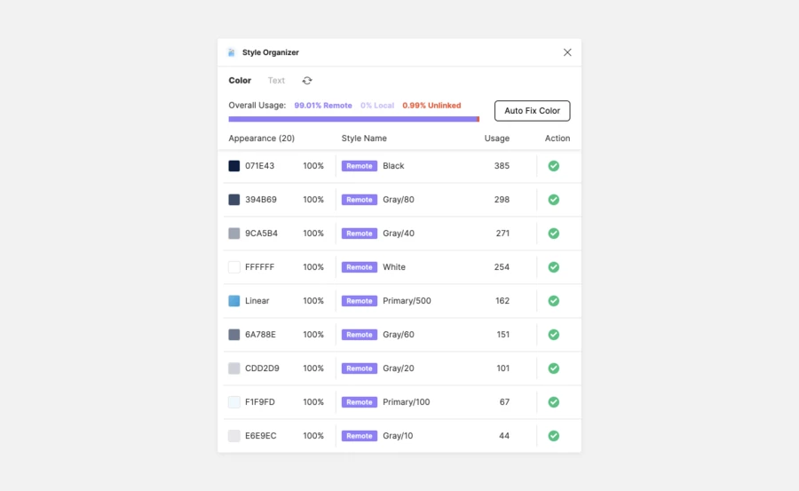
With the Style Organizer you can get an overview of the color and text styles used on the page you are currently on. It also has a feature to select all elements that use a specific style (linked or unlinked). By clicking on the target icon all elements on that page that use the chosen style will be selected.
Note that this only works per page and not for the whole document.
The plugin is meant to fix unlinked color and text styles and double check if there are colors or texts on the page that shouldn’t be there.
Conclusion: Onboarding Devs with Figma
Since introducing this onboarding guide a lot of questions and misunderstandings have vanished. The design review in general has gotten a lot simpler since many discrepancies happened before by looking at the wrong element and taking the wrong measurements. In general using Figma has made it fairly easy for developers to inspect the design and take the necessary styling out of it.

